Negative Space can be referred to the area of the web page or the logo which is not occupied by any content. It is the space between specific elements and items on the page. Negative Space, also known as White Space, does not have to be white or in any solid color. Backgrounds, gradients and patterns can also be part of Negative Space. It is known as White Space in the print field simply because most of the publications have white background color.
Relevance of Negative Space
In quest of a strong layout and design, it is important to delegate consistent spacing between
each elements on the page. Although, there are no rules that differentiates good design from bad design but there are certain guidelines that can help you achieve success with design. The physical space occupied by each element should be in relation to the other items on the page. Without which, even websites containing artworks from brilliant designers will end up looking cramped and unattractive.
While viewing a website, even though your mind is paying attention to the main content, but your subconscious mind is also noticing things that envelop the main content. This subconscious behavior plays a vital part in the flow of reading and interacting with the website. The flow can be interrupted if there’s a nuisance with regards to space or any other factor. Therefore, Negative Spacing is an integral part of visible composition, even if it’s mostly processed by subconscious mind.
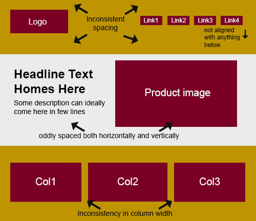
To illustrate the concept, let’s have a look at the 2 images below.
Inconsistently spaced layout:
Fixing the problem:
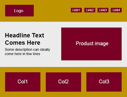
You’ll notice that the spacing has corrected in the second layout and the gaps all across the layout are in similar volume. This gives a much more logical distribution of negative space all across the page and thereby avoiding the visitor’s subconscious mind to get distracted from the flow of reading.
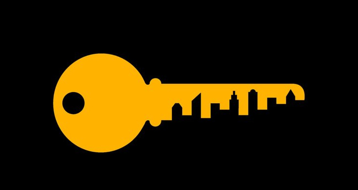
Creative use of Negative Space in Logo designing
Logo design is often the wittiest form of design. It is in logo design that Negative Spacing commands equal prominence as the logo itself. In logo design, when space and subject are well defined, negative space can sometimes become the “real” subject of a composition. This gives rise to an optical illusion called figure-ground reversal. This particular effect has been recently very fashionable amongst logo designers.
Here are some of the creative uses of Negative spacing in Logo Designing:
FedEx Logo

Art Peak
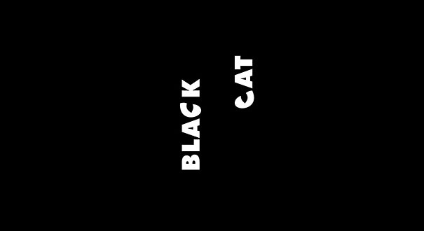
Black Cat

Dig

Eagle Mountain
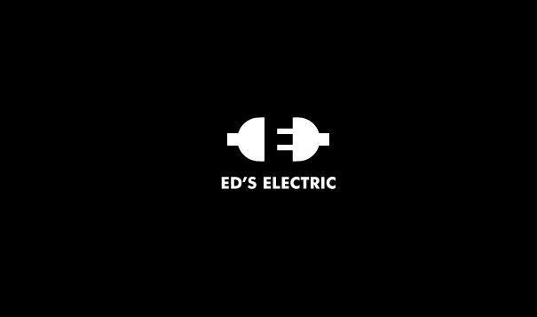
ED’s Electric
Egg n Spoon
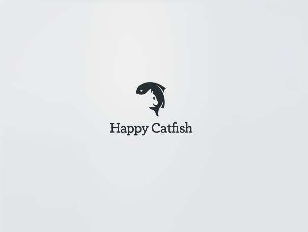
Happy Cat-Fish
Human
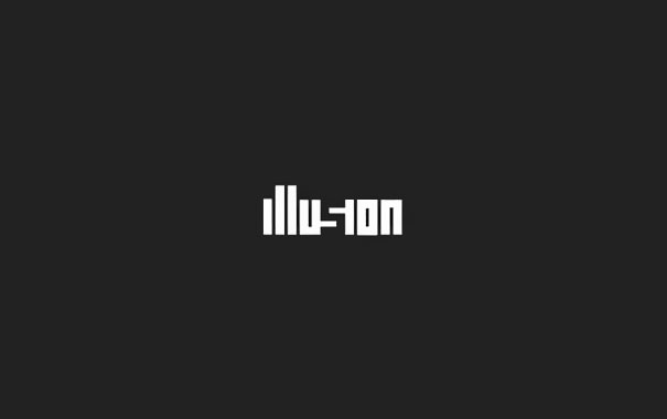
Illusion
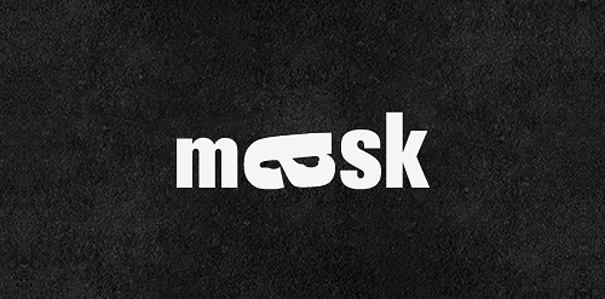
Mask
Nexcite logo
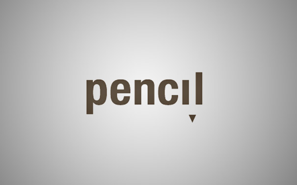
Pencil
Conclusion:
By now, you should recognize what negative space is and how to identify it in your design. Negative space both unclutters design and helps mould and draw focus to the content on the page. Witty use of negative space can translate it being the primary subject of the art work especially in logo design.